In this lesson we look at the language used to describe graphs. Graphs help people understand data quickly. You can use them to make a comparison or show a trend.
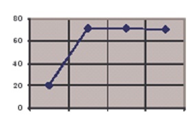
Production grew rapidly in the first quarter, but reached a plateau of about 70. Since then it has remained more or less stable.
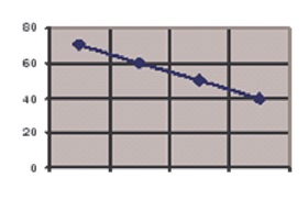
Production started climbing steadily but flattened off at a level of around 70. Since then, it has fallen steadily.
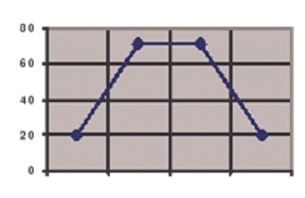
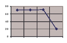
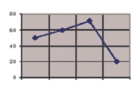
Production grew more and more rapidly over the first three quarters but then reached a peak. Since then, it has quickly dropped.
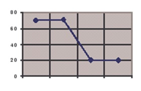
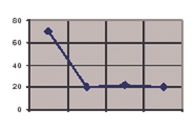
Production started the year in a stable position, but then plunged in the third quarter. It has now flattened out at a level of 20.
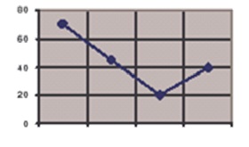
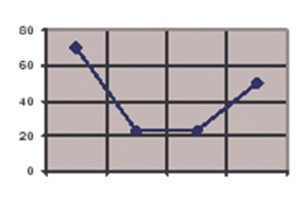
Production fell considerably over the first three quarters, reaching a low of 20. Since then it has staged a partial recovery.
There has been a slight increase in production over the year.
Production started off steady, but fell sharply in the last quarter.
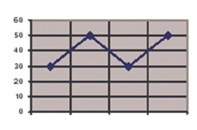
Production has fluctuated all year.
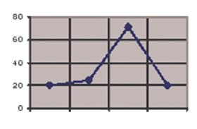
Production showed a marginal rise in the first three quarters, but then suffered a sharp drop.
After a considerable drop in the first two quarters, production bottomed out at 20. Since then it has started to rise.
There was a rapid drop in production in the first quarter, but it bottomed out at about 20.
Production has dropped slowly but steadily over the year.
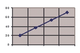
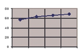
Production has experienced a strong, steady growth over the whole year.