Sample IELTS Essay Writing
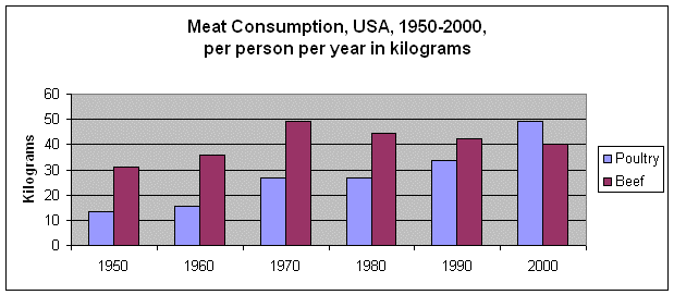
The graph shows changes in the amount of chicken and beef eaten in the USA over the last 50 years. Overall, beef consumption is declining, while Americans are eating more and more chicken.
The biggest change in the graph is the increase in poultry consumption. This soared from just 12 kilograms per person per year in 1950 to almost 50 kilograms in 2000, increasing four times. The biggest increase was between 1990 and 2000, when it jumped almost by half, from just 35 kilos to almost 50kg. That was the period when poultry consumption overtook beef for the first time.
The other trend in the graph is the decline in beef consumption. Although more beef was eaten in 2000 than in 1950, at 40 kilos per person per year compared to 32 kilos in 1950, there has been a big drop since 1970. Sales of beef peaked in 1970 at almost 50kg and have declined steadily since then.
In conclusion, Americans are eating much more meat overall than they were in 1950, but the proportion of chicken and turkey products has increased sharply, while beef consumption is declining in importance.
195 words
